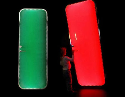
The Brightdoor is green when unlocked, red when locked. Pretty simple . Apparently Lervik Design (the company responsible) first made just handles that lit up. But after realizing you could waste a lot more energy if the whole door glowed, they created this monstrosity. But as ridiculous as it is, I kind of like it. But instead of indicating locked or unlocked, I think it should be enter/do not enter (serving a similar function to the "do not disturb" signs in hotels and the sock you used to hang on your dormroom door in college).
Subscribe to:
Post Comments (Atom)


No comments:
Post a Comment